Diagrammes en radar avancés pour ggplot2 (Enhanced Radar Plots for ggplot2)
Source:R/functions.R
ggradar.RdDiagrammes en radar avancés pour ggplot2 (Enhanced Radar Plots for ggplot2)
Usage
ggradar(
  plot.data,
  base.size = 15,
  font.radar = "sans",
  values.radar = c("0%", "50%", "100%"),
  axis.labels = colnames(plot.data)[-1],
  grid.min = 0,
  grid.mid = 0.5,
  grid.max = 1,
  centre.y = grid.min - ((1/9) * (grid.max - grid.min)),
  plot.extent.x.sf = 1,
  plot.extent.y.sf = 1.2,
  x.centre.range = 0.02 * (grid.max - centre.y),
  label.centre.y = FALSE,
  grid.line.width = 0.5,
  gridline.min.linetype = "longdash",
  gridline.mid.linetype = "longdash",
  gridline.max.linetype = "longdash",
  gridline.min.colour = "grey",
  gridline.mid.colour = "#007A87",
  gridline.max.colour = "grey",
  grid.label.size = 6,
  gridline.label.offset = -0.1 * (grid.max - centre.y),
  label.gridline.min = TRUE,
  label.gridline.mid = TRUE,
  label.gridline.max = TRUE,
  axis.label.offset = 1.15,
  axis.label.size = 5,
  axis.line.colour = "grey",
  group.line.width = 1.5,
  group.point.size = 6,
  group.colours = NULL,
  background.circle.colour = "#D7D6D1",
  background.circle.transparency = 0.2,
  plot.legend = if (nrow(plot.data) > 1) TRUE else FALSE,
  legend.title = "",
  plot.title = "",
  legend.text.size = 14,
  legend.position = "left"
)
Source
Most of the code is from https://rstudio-pubs-static.s3.amazonaws.com/5795_e6e6411731bb4f1b9cc7eb49499c2082.html.
Arguments
- plot.data
dataframe comprising one row per group
- base.size
text size
- font.radar
text font family
- values.radar
values to print at minimum, 'average', and maximum gridlines
- axis.labels
names of axis labels if other than column names supplied via plot.data
- grid.min
value at which mininum grid line is plotted
- grid.mid
value at which 'average' grid line is plotted
- grid.max
value at which maximum grid line is plotted
- centre.y
value of y at centre of plot
- plot.extent.x.sf
controls relative size of plot horizontally
- plot.extent.y.sf
controls relative size of plot vertically
- x.centre.range
controls axis label alignment
- label.centre.y
whether value of y at centre of plot should be labelled
- grid.line.width
width of gridline
- gridline.min.linetype
line type of minimum gridline
- gridline.mid.linetype
line type of 'average' gridline
- gridline.max.linetype
line type of maximum gridline
- gridline.min.colour
colour of minimum gridline
- gridline.mid.colour
colour of 'average' gridline
- gridline.max.colour
colour of maximum gridline
- grid.label.size
text size of gridline label
- gridline.label.offset
displacement to left/right of central vertical axis
- label.gridline.min
whether or not to label the mininum gridline
- label.gridline.mid
whether or not to label the 'mininum'average' gridline
- label.gridline.max
whether or not to label the maximum gridline
- axis.label.offset
vertical displacement of axis labels from maximum grid line, measured relative to circle diameter
- axis.label.size
text size of axis label
- axis.line.colour
colour of axis line
- group.line.width
line width of group
- group.point.size
point size of group
- group.colours
colour of group
- background.circle.colour
colour of background circle/radar
- background.circle.transparency
transparency of background circle/radar
- plot.legend
whether to include a plot legend
- legend.title
title of legend
- plot.title
title of radar plot
- legend.text.size
text size in legend
- legend.position
position of legend, valid values are "top", "right", "bottom", "left"
Examples
library(dplyr)
library(scales)
library(tibble)
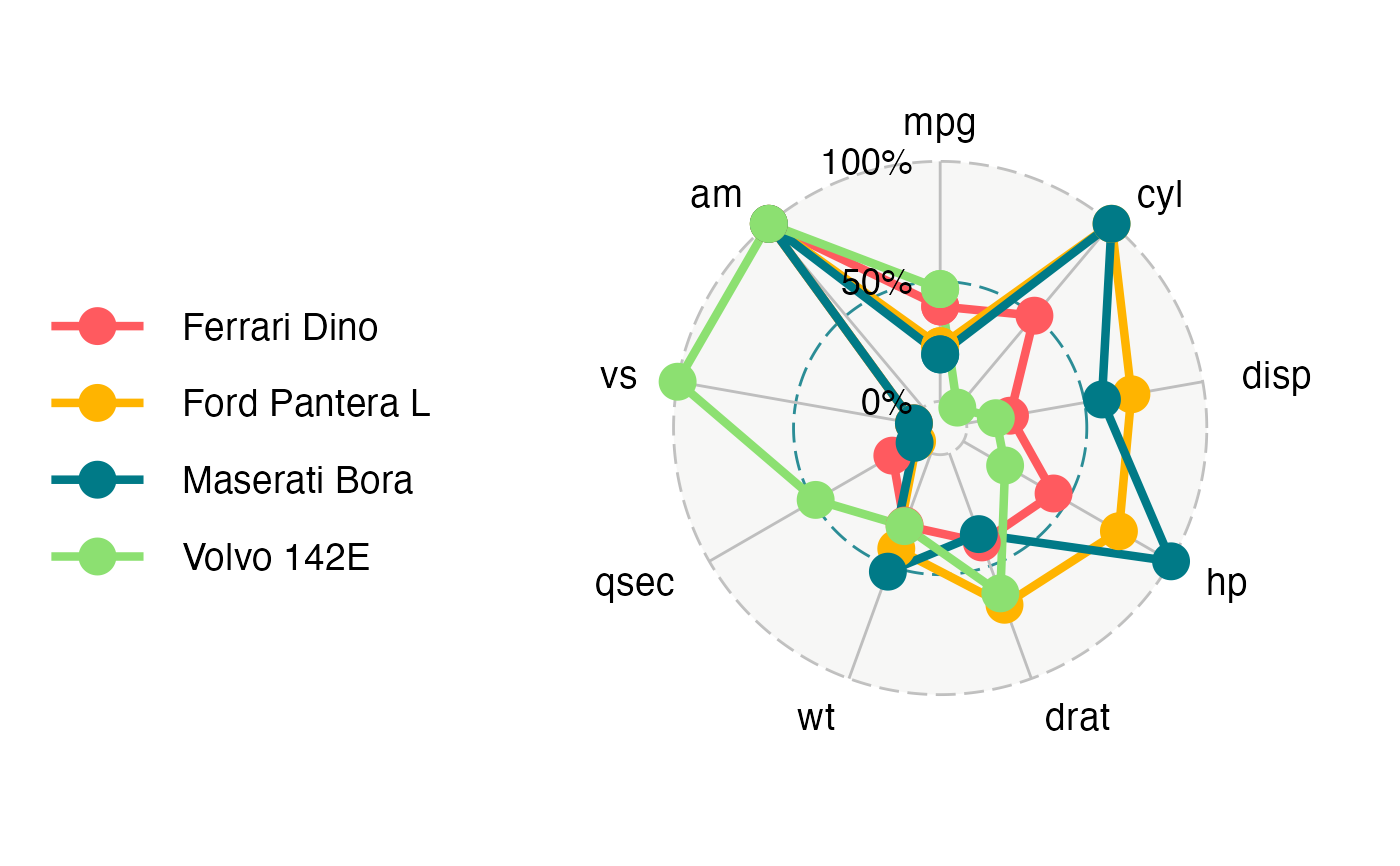
mtcars_radar <- mtcars %>%
as_tibble(rownames = "group") %>%
mutate_at(vars(-group), rescale) %>%
tail(4) %>%
select(1:10)
mtcars_radar
#> # A tibble: 4 × 10
#> group mpg cyl disp hp drat wt qsec vs am
#> <chr> <dbl> <dbl> <dbl> <dbl> <dbl> <dbl> <dbl> <dbl> <dbl>
#> 1 Ford Pantera L 0.230 1 0.698 0.749 0.673 0.424 0 0 1
#> 2 Ferrari Dino 0.396 0.5 0.184 0.435 0.396 0.321 0.119 0 1
#> 3 Maserati Bora 0.196 1 0.573 1 0.359 0.526 0.0119 0 1
#> 4 Volvo 142E 0.468 0 0.124 0.201 0.622 0.324 0.488 1 1
ggradar(mtcars_radar)
#> Warning: Using `size` aesthetic for lines was deprecated in ggplot2 3.4.0.
#> ℹ Please use `linewidth` instead.
#> ℹ The deprecated feature was likely used in the sageR package.
#> Please report the issue at <https://github.com/fbertran/sageR/issues/>.
#> Ignoring unknown labels:
#> • size : "14"